Hello
Build faster with the ui-kit.ai MCP serverBeautiful UI components
Beautiful UI components
for AI-powered apps
Professionally designed components, optimized for fast iteration in AI workflows. Accessible, customizable, and ready for production.
Everything you need...
Themeable
Quickly customize your app's look & feel with our theme editor.
Composable
Simple component APIs that can be combined into powerful recipes.
Accessible
Built with React Aria, the foremost accessibility-first UI primitives library.
MCP server
Give your assistant UI super powers with our MCP server.
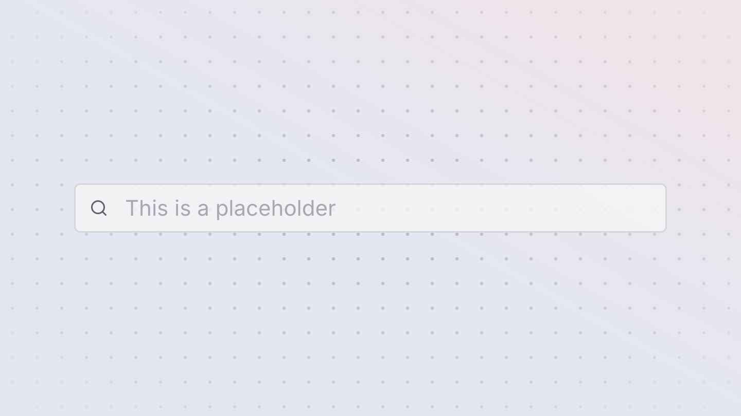
Dark mode
Automatic light/dark mode support for all custom themes.
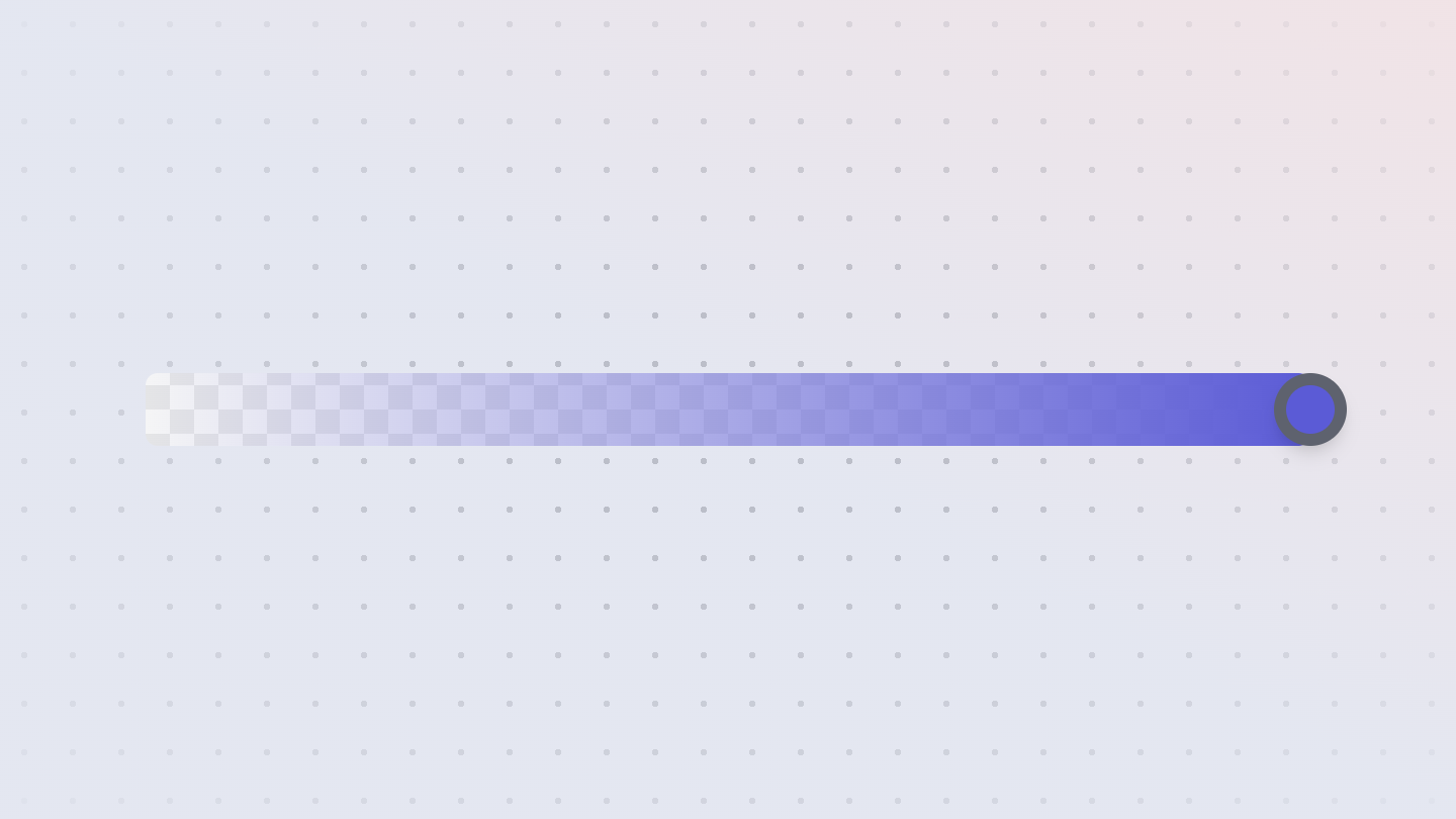
Simple installation
Start building straight away with a single npm install.
Performant
Tree-shakeable, small footprint and minimal runtime overhead.
Developer experience
48 beautifully designed components...
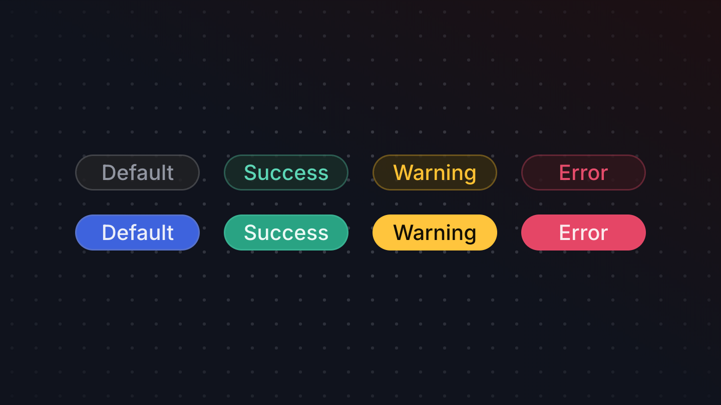
Alert
An alert is a message that is displayed to the user. It makes use of the ARIA role "alert" to highlight the importance of the message to assistive technologies.
Avatar
Renders an avatar. Falls back to initial letters if no image is provided.
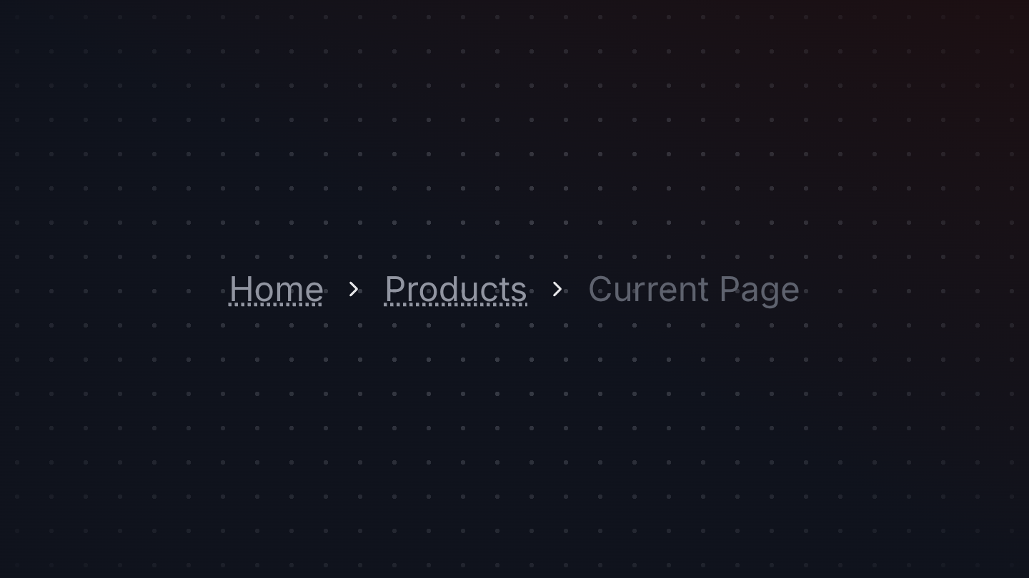
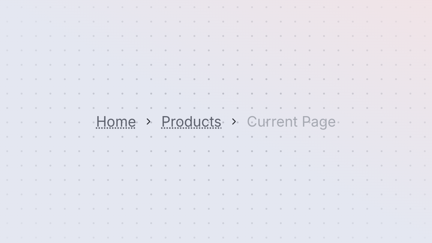
Breadcrumbs
Breadcrumbs display a hierarchy of links to the current page or resource in an application.
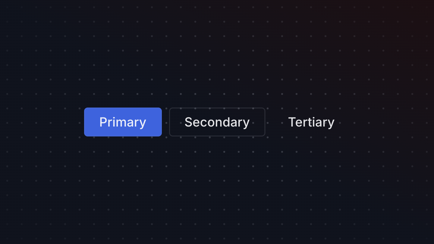

Button
A button allows a user to perform an action, with mouse, touch, and keyboard interactions.

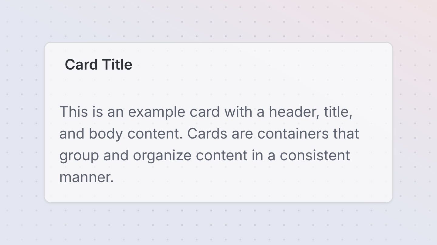
Card
A Card is a container that groups and organizes content in a consistent manner.


Chat
A Chat contains a list of messages.
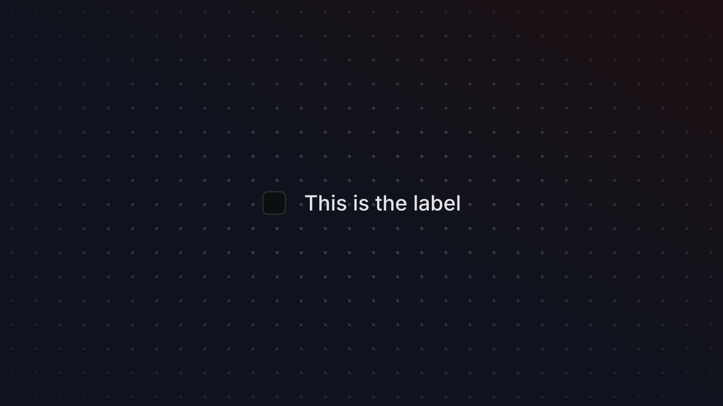
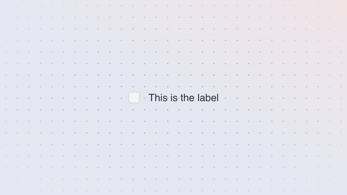
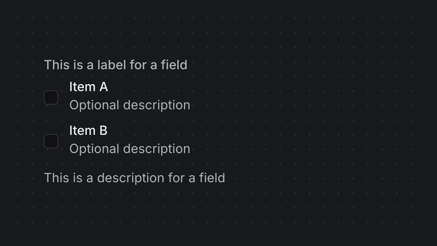
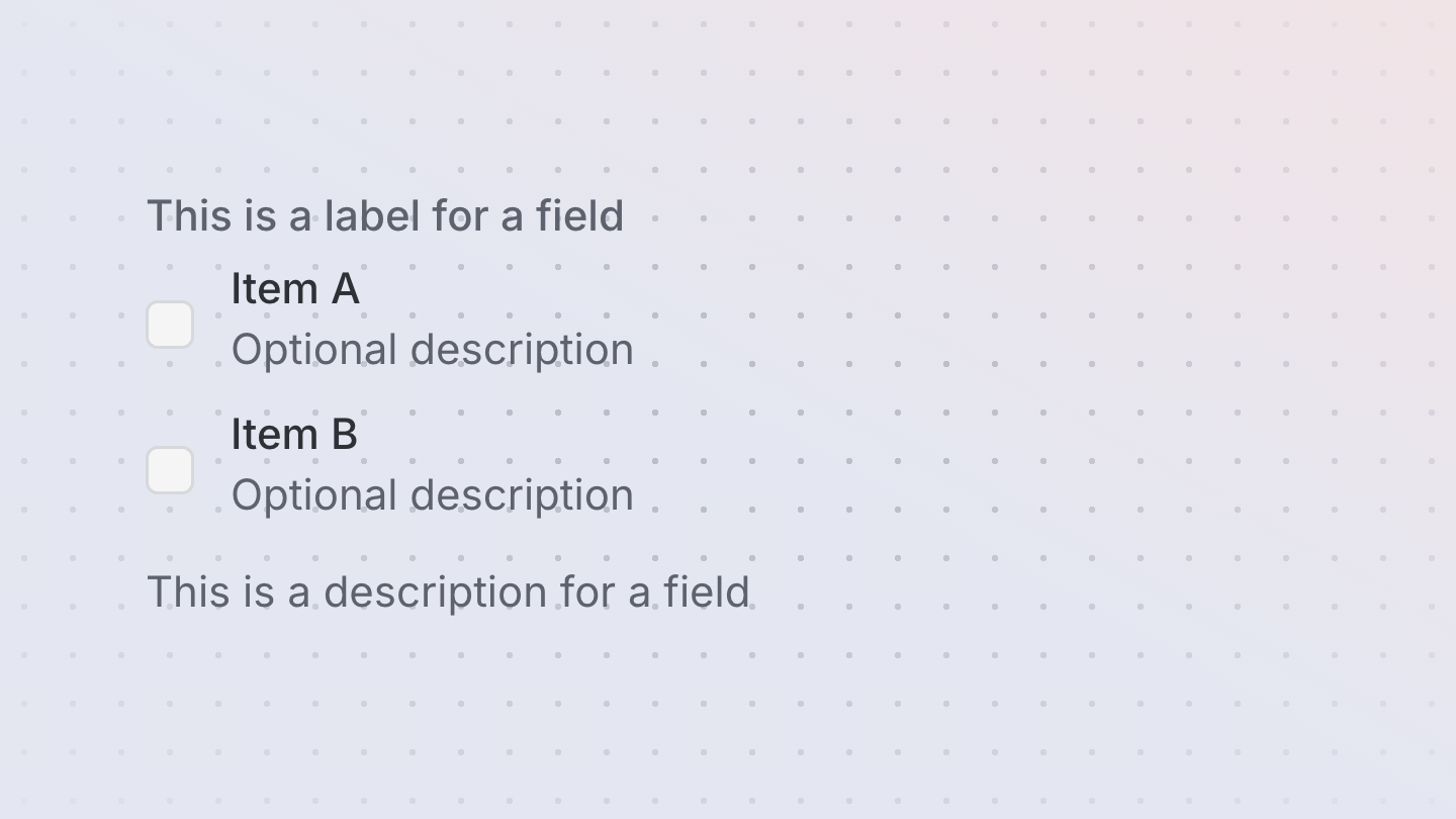
Checkbox
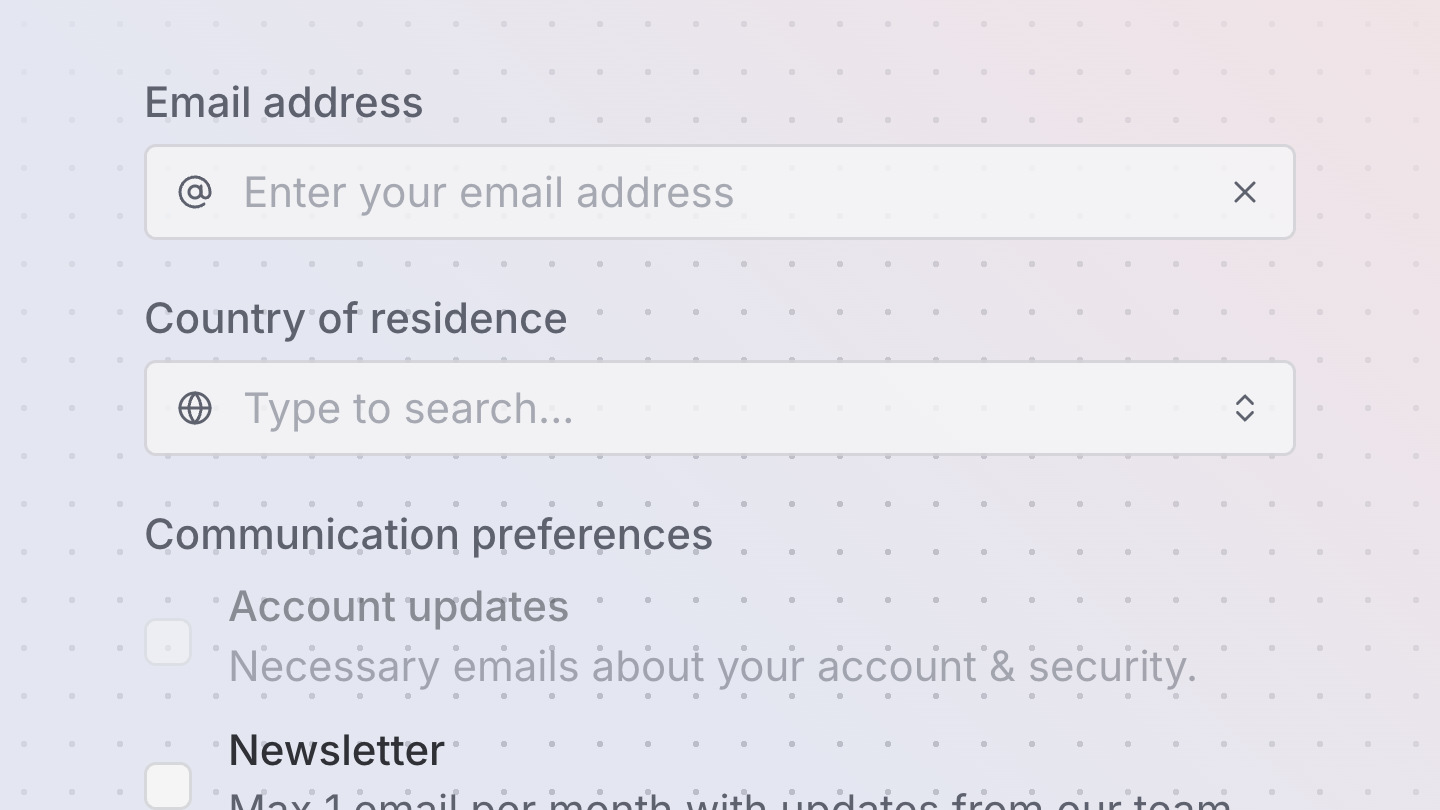
A checkbox allows a user to select multiple items from a list of individual items, or to mark one individual item as selected.

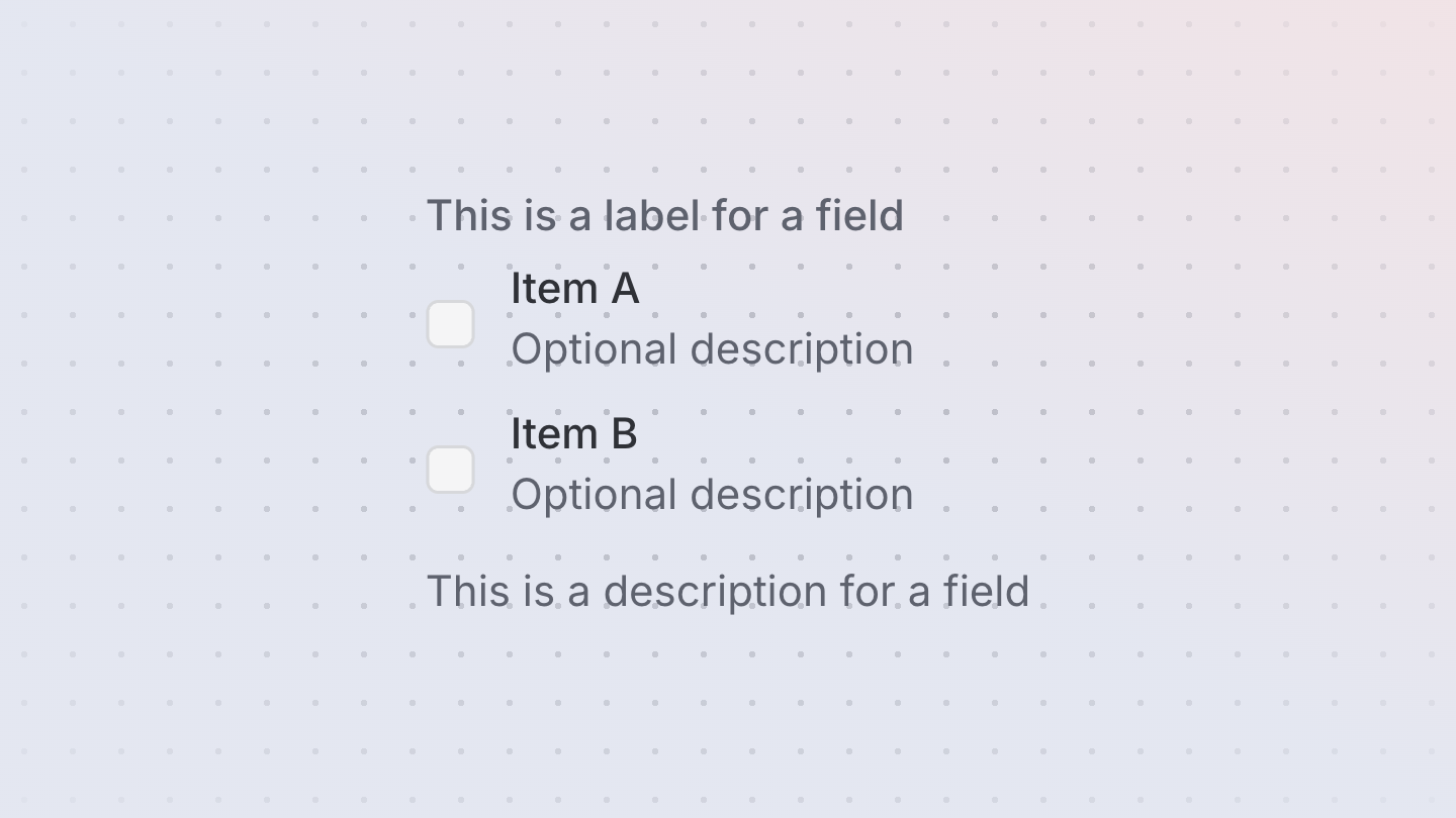
CheckboxGroup
A checkbox group allows a user to select multiple items from a list of options.
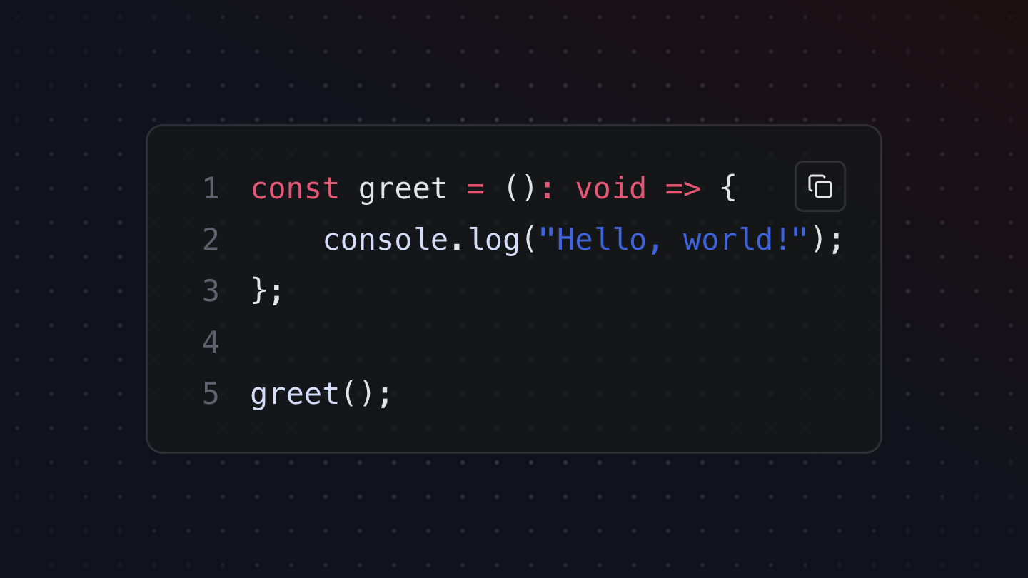
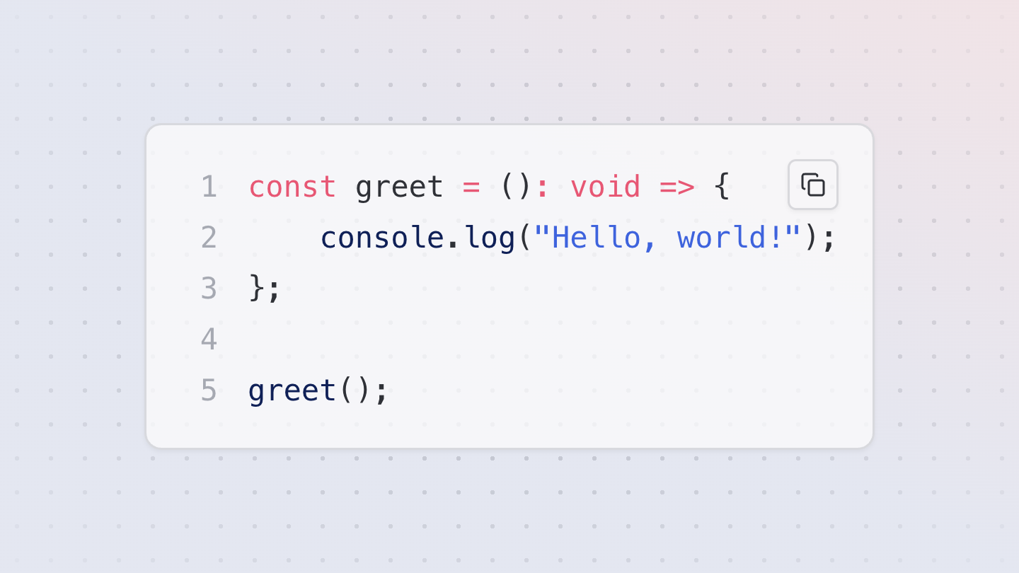
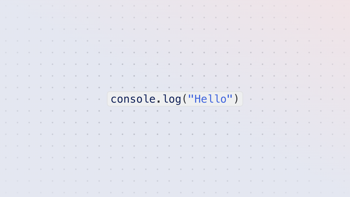
CodeBlock
A syntax-highlighted code block component, built using react-syntax-highlighter.
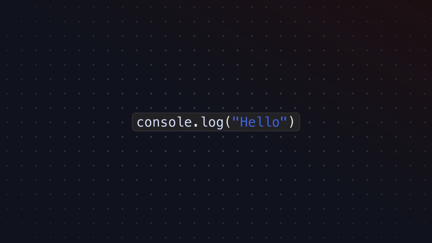
CodeInline
A syntax-highlighted inline code component, built using react-syntax-highlighter.
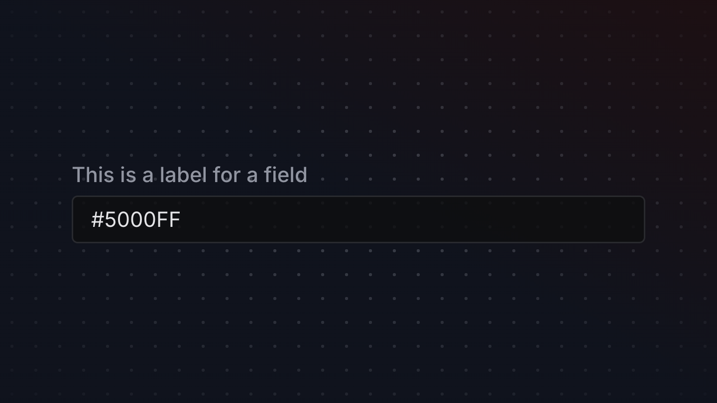
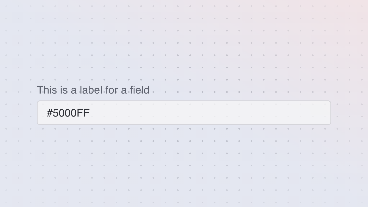
ColorField
A color field allows users to edit a hex color or individual color channel value.
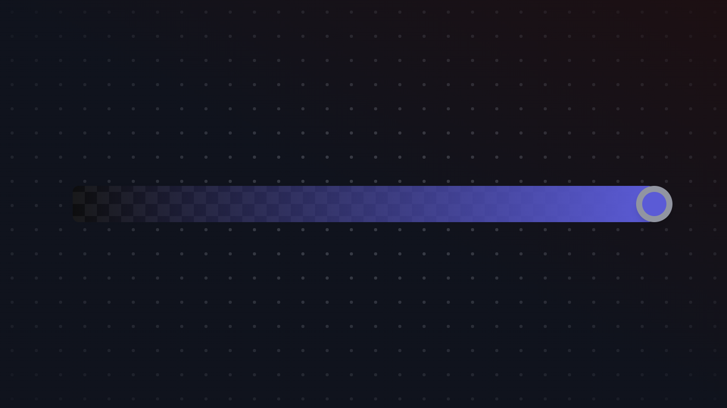
ColorSlider
A component for selecting a color using a slider. Provides interactive color selection with proper accessibility semantics.
ColorSwatch
A component for displaying a color swatch. Provides visual representation of a color with proper accessibility semantics.
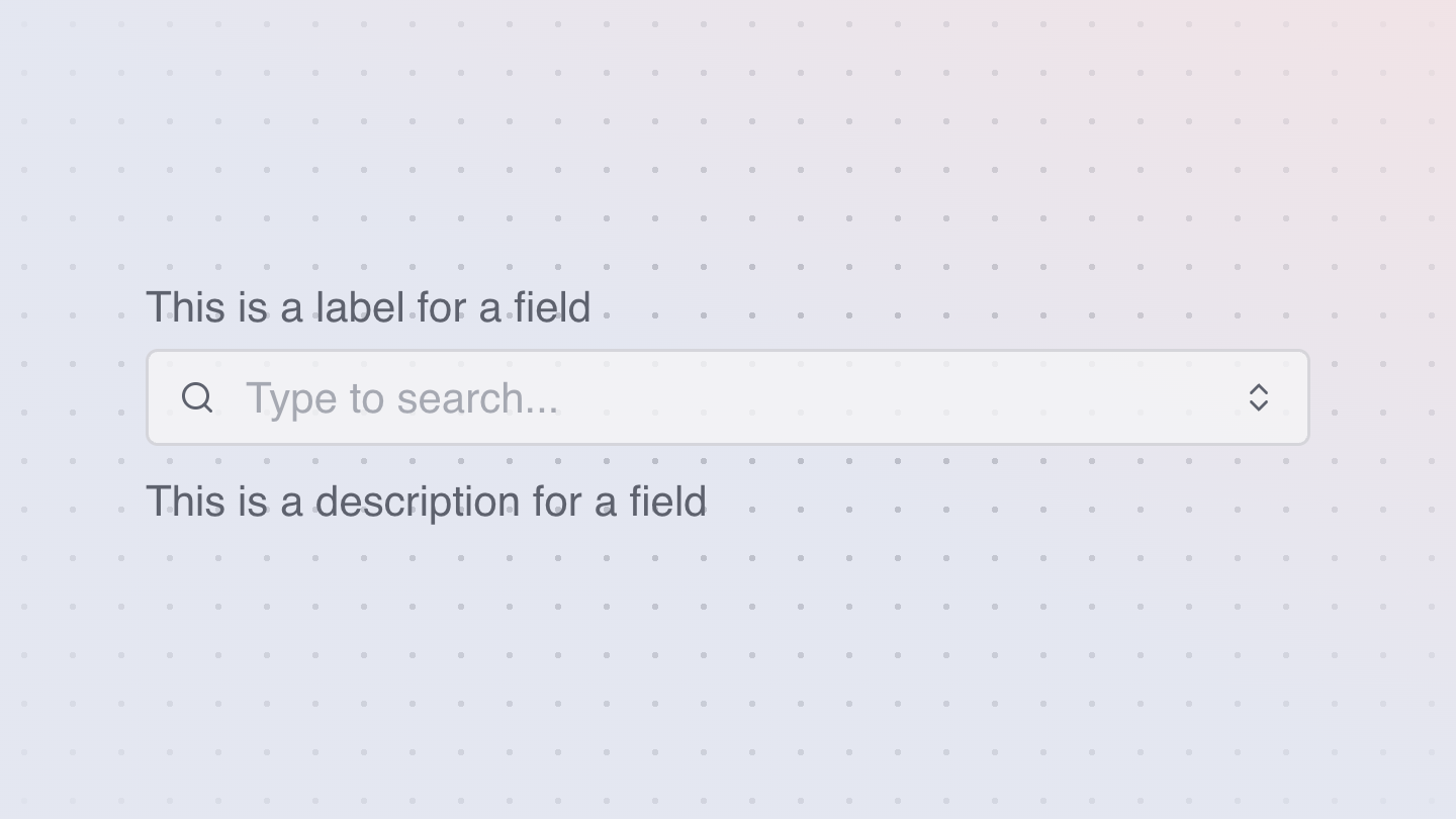
ComboBox
A combo box combines a text input with a listbox, allowing users to filter a list of options to items matching a query.
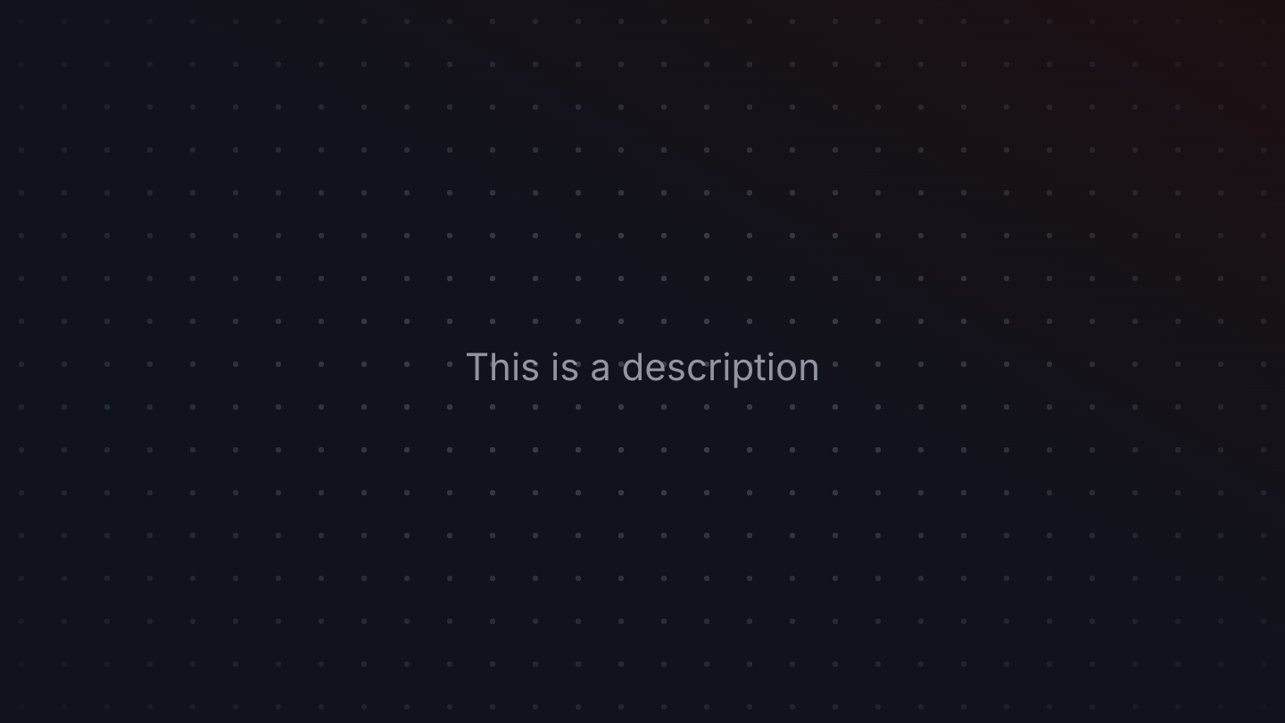
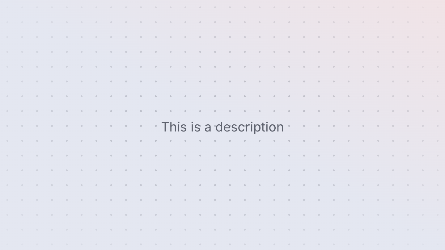
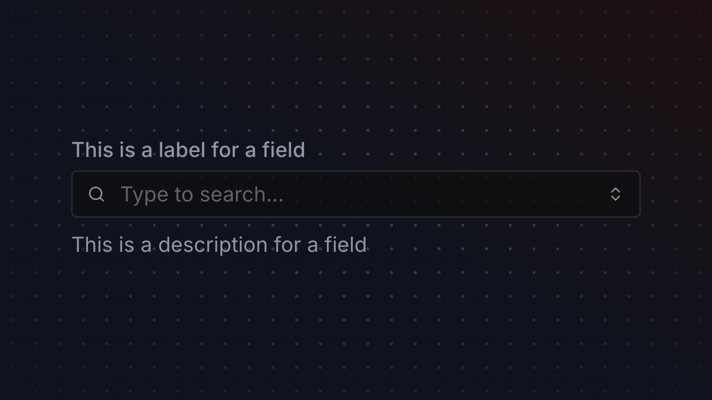
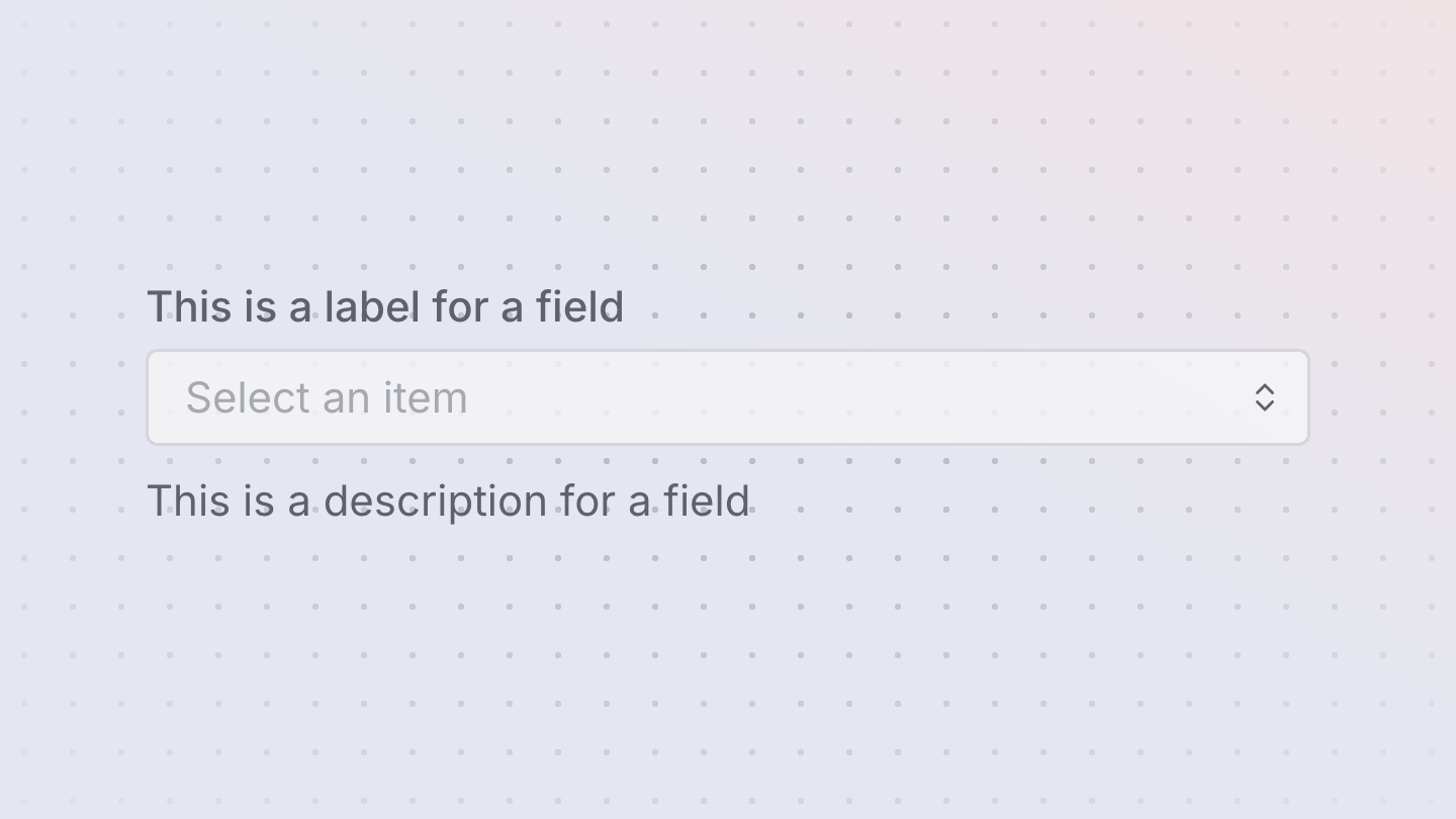
Description
A Description is text with attributes that improve screen reader announcements, usually used to provide more context on a field or control.
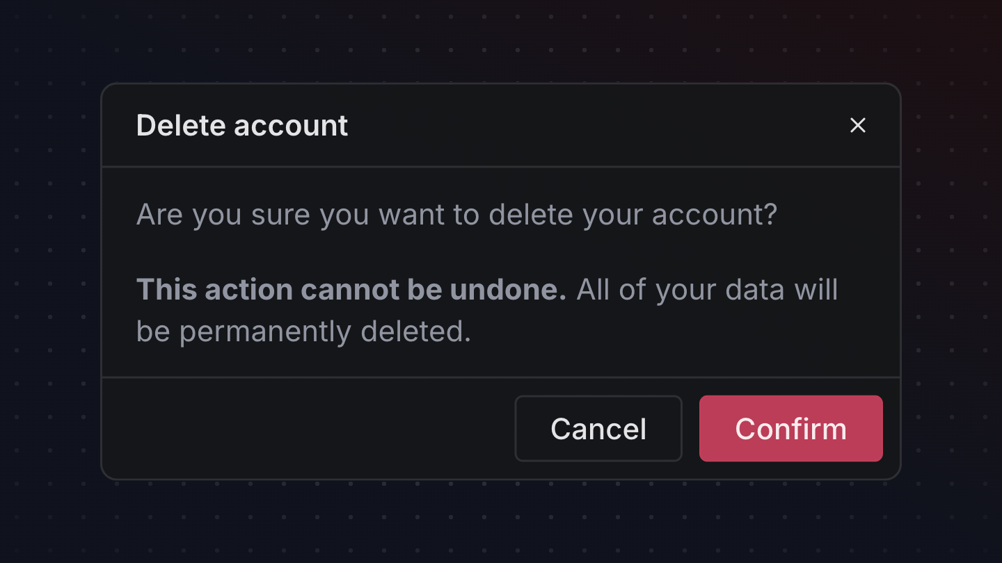
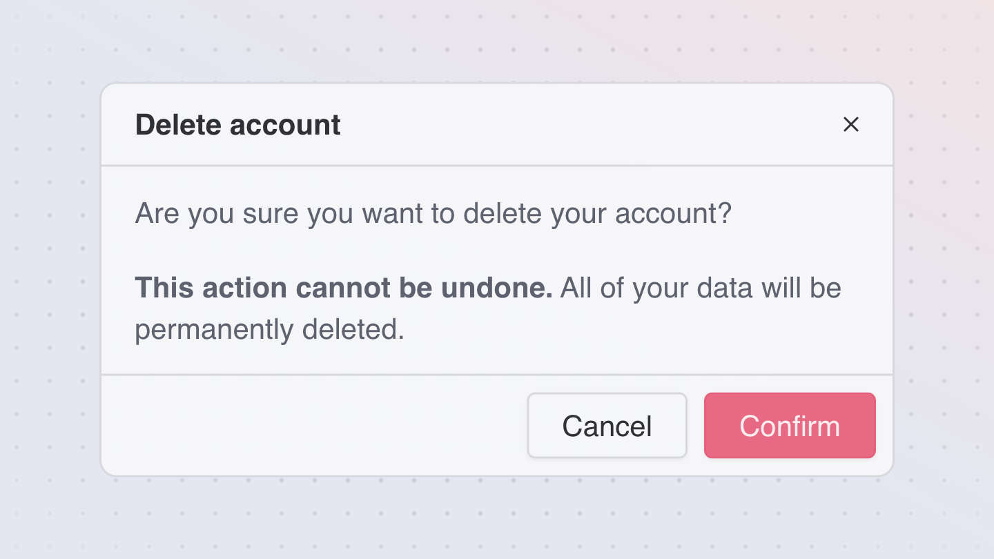
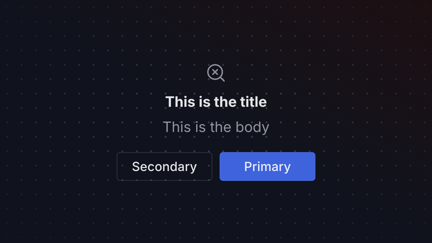
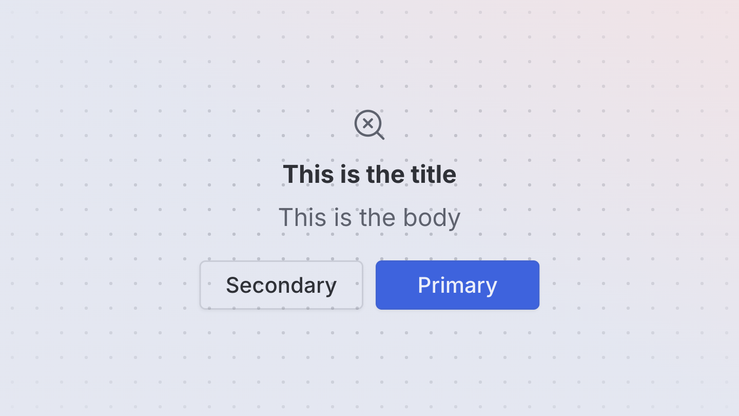
Dialog
A dialog is an overlay shown above other content in an application.
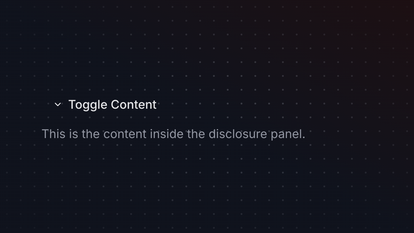
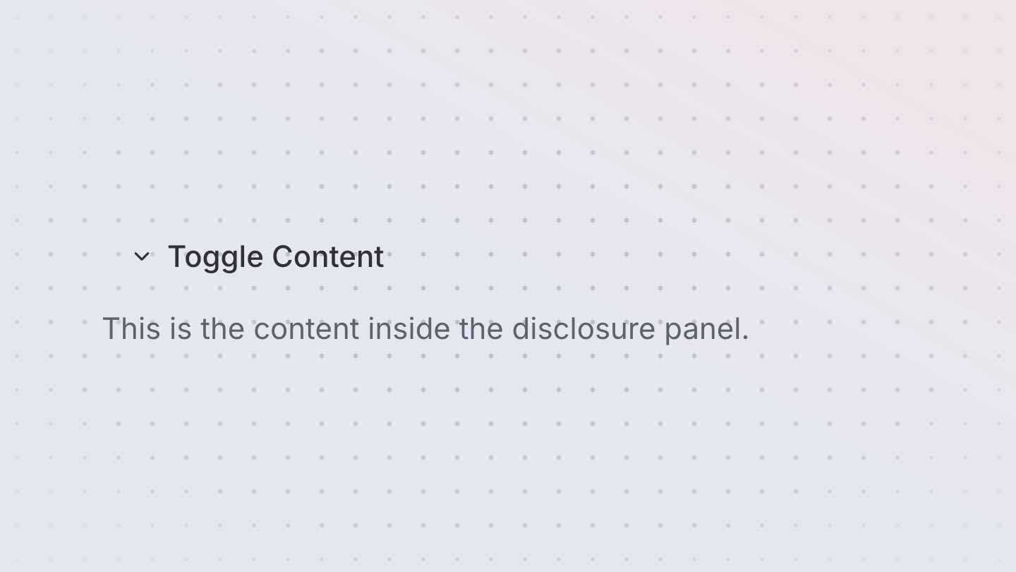
Disclosure
A disclosure component that shows and hides content when triggered.
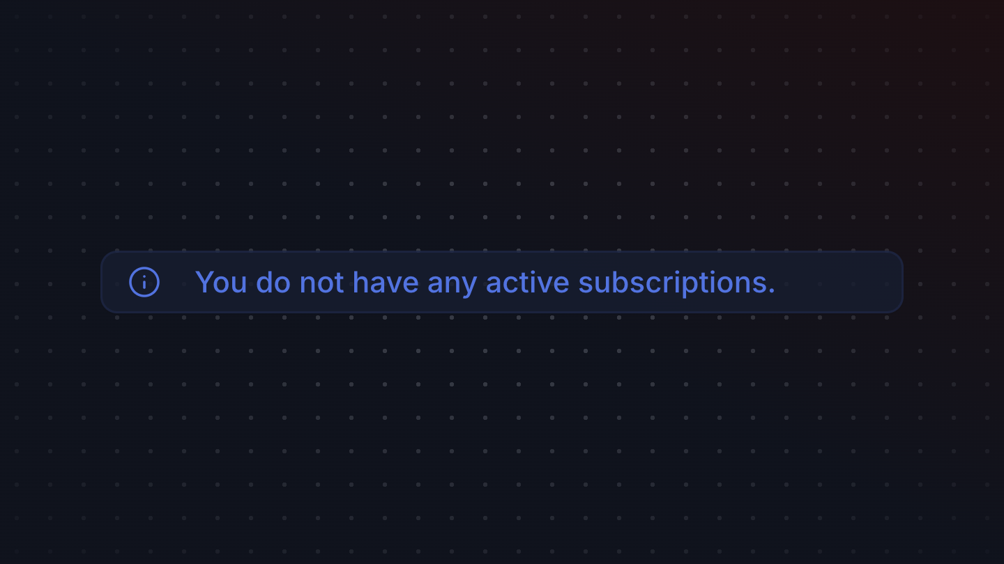
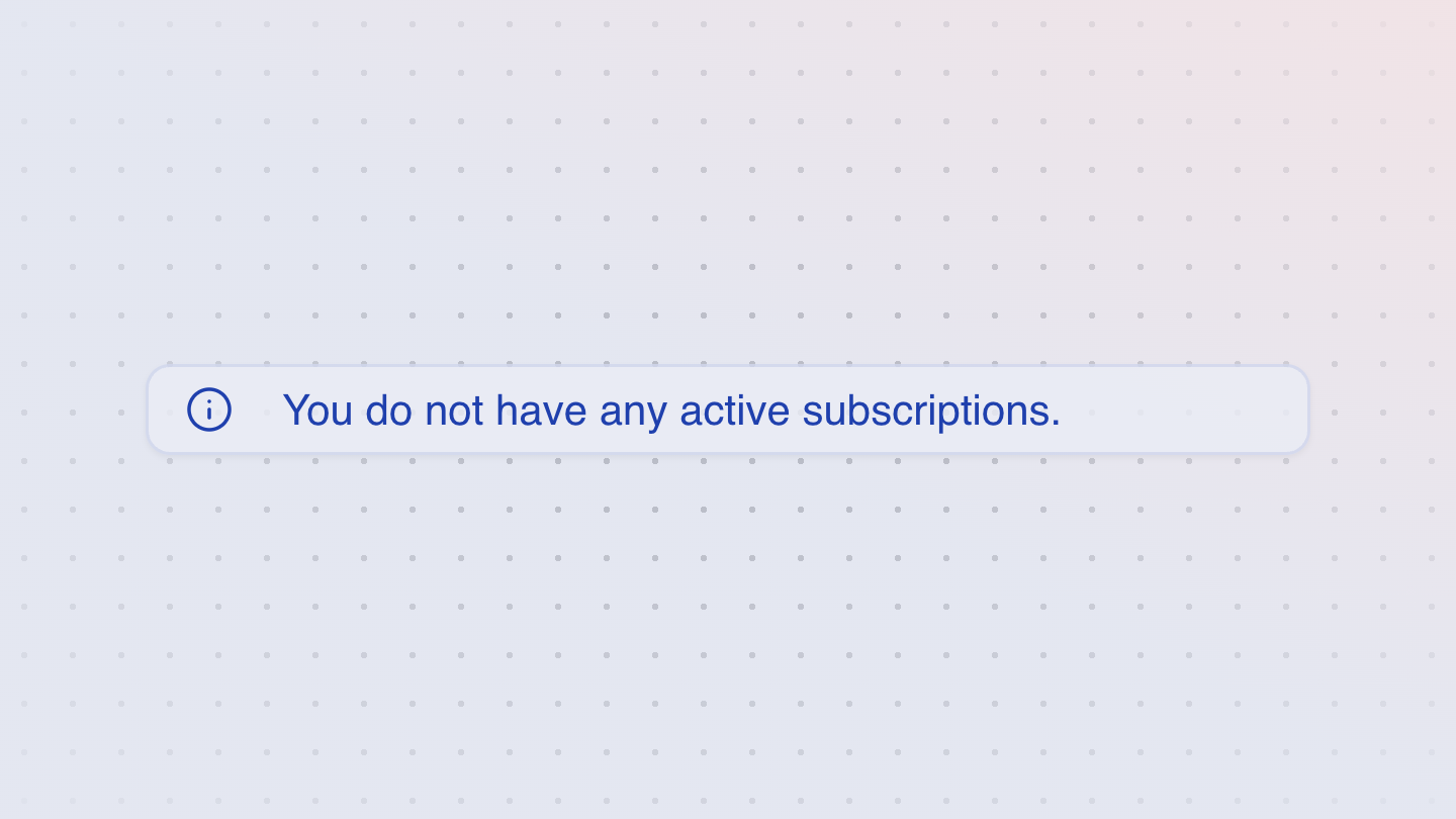
EmptyState
An empty state is a fallback UI shown in the absence of data, e.g. for a search with no results.

FieldButton
A field button can used inside a group component to add additional functionality to a field.


FieldError
A field error displays validation errors for a field within a form.

FieldGroup
A group represents a set of related UI controls, and supports interactive states for styling.
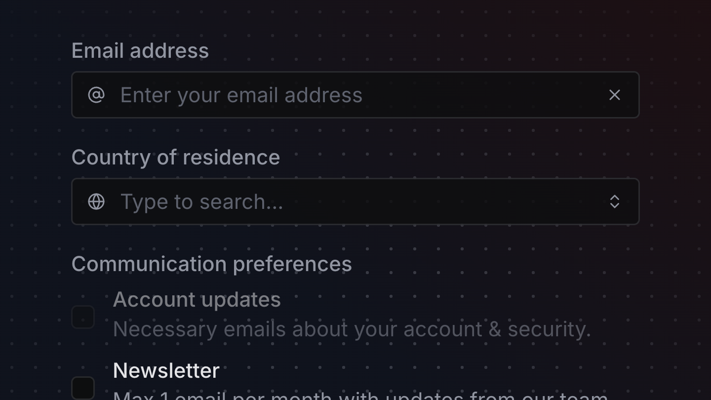
Form
A form is a group of inputs that allows users to submit data to a server, with support for providing field validation errors.
FormCheckboxGroup
A FormCheckboxGroup connects a CheckboxGroup to a Form component using react-hook-form.

FormComboBox
A FormComboBox connects a ComboBox to a Form component using react-hook-form.

FormResetOnSubmit
A component that resets the form after a successful submission. Used to test that form fields are reset after a successful submission.

FormSelect
A FormSelect connects a Select to a Form component using react-hook-form.
FormSubmitButton
A FormSubmitButton handles form submission, and listen's to
react-hook-form's state to handle disabled * pending states appropriately.
FormTextField
A form text field connects a <TextField /> to a <Form /> component using react-hook-form.
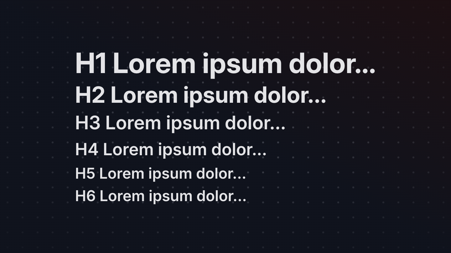
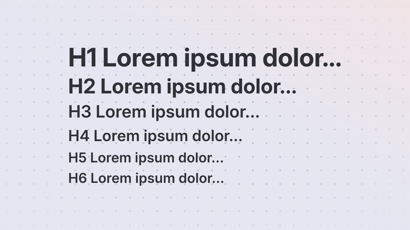
Heading
A heading renders a semantic heading with pre-determined typography styles
Input
An input is a primitive component used when composing fields, like text fields, search fields, etc.
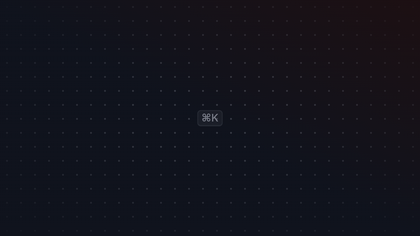
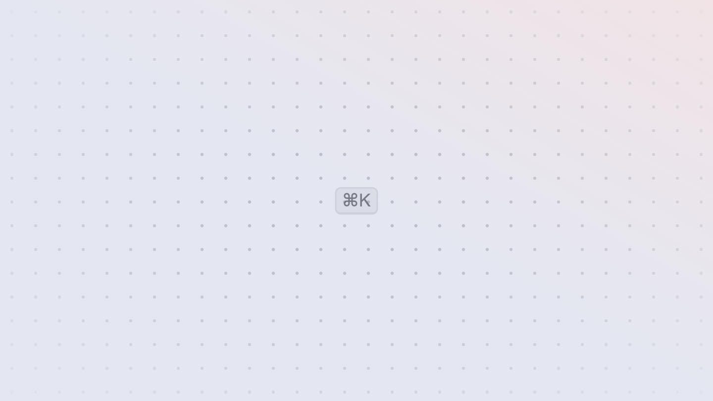
Kbd
Signals that a keyboard shortcut is available for the user to use.
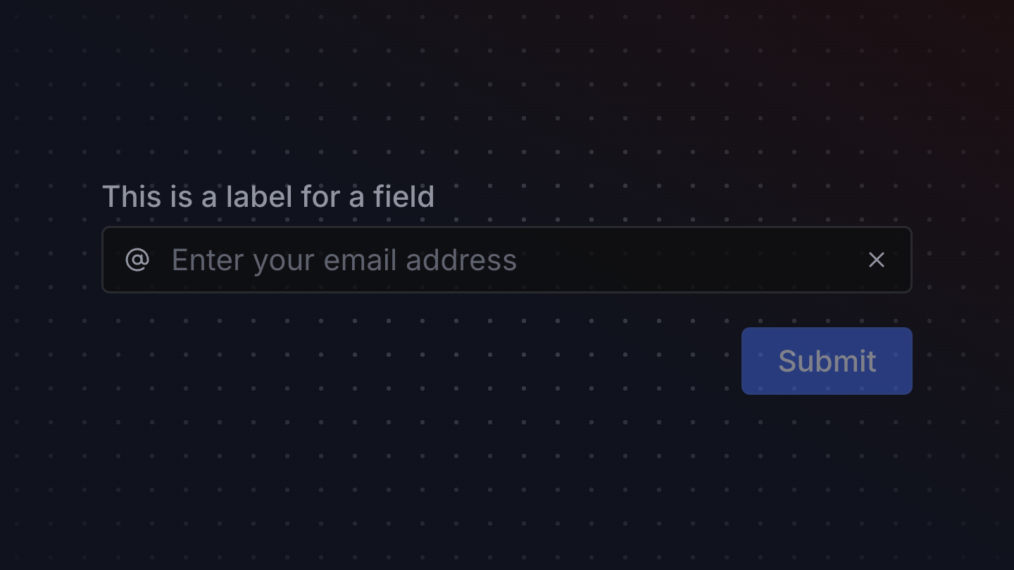
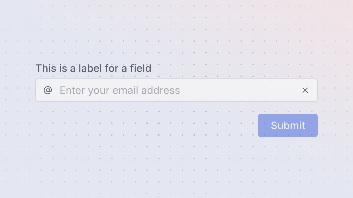
Label
A Label is used when composing a form field, and handles associating the
label with the field via the id and for attributes on your behalf.


Link
A link allows a user to navigate to another page or resource within a web page or application.
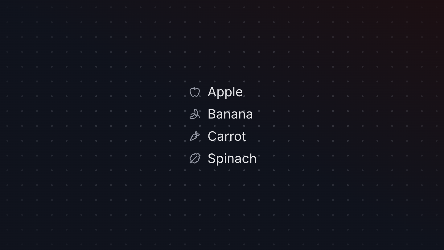
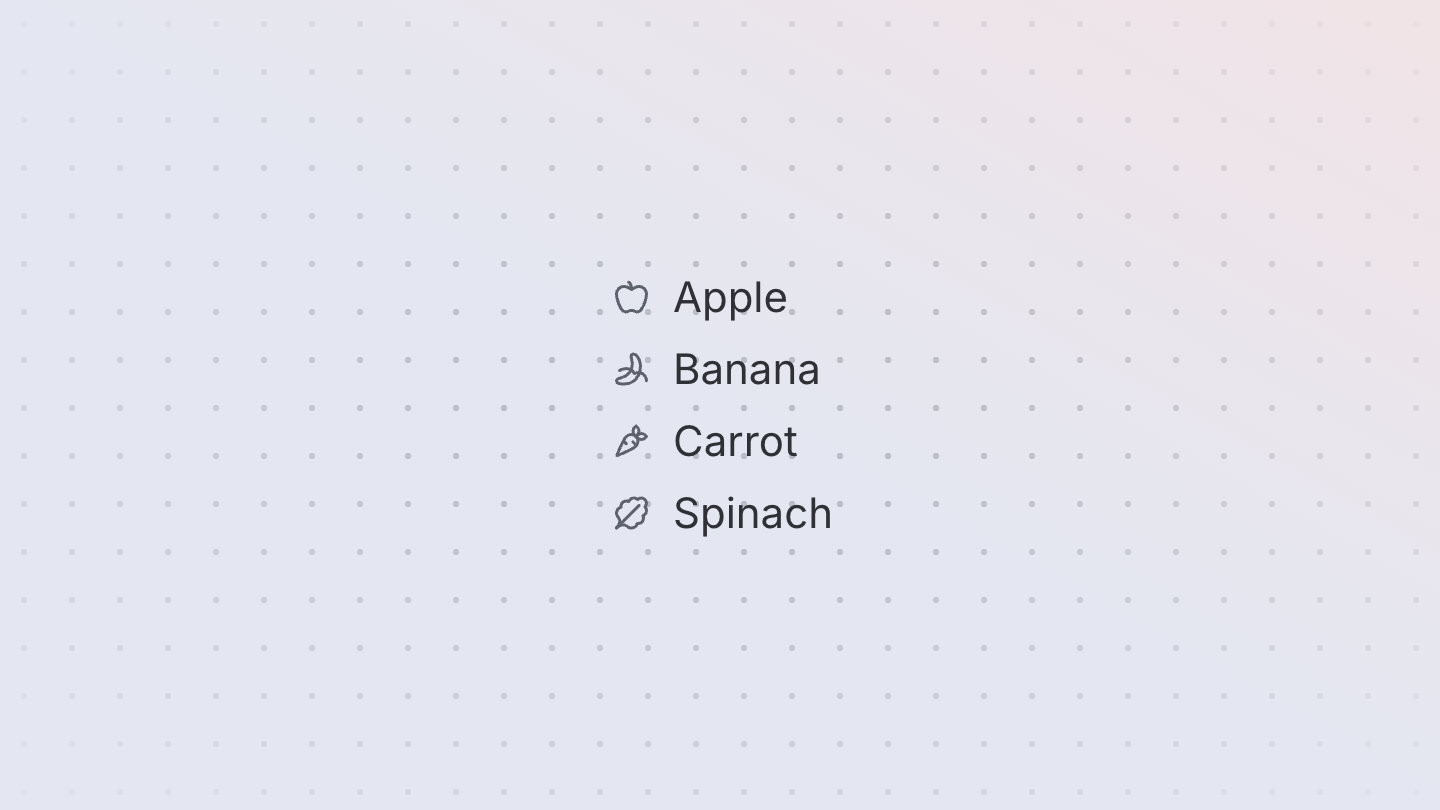
ListBox
A listbox displays a list of options and allows a user to select one or more of them.


Loader
A loader icon to indicate that content is loading.
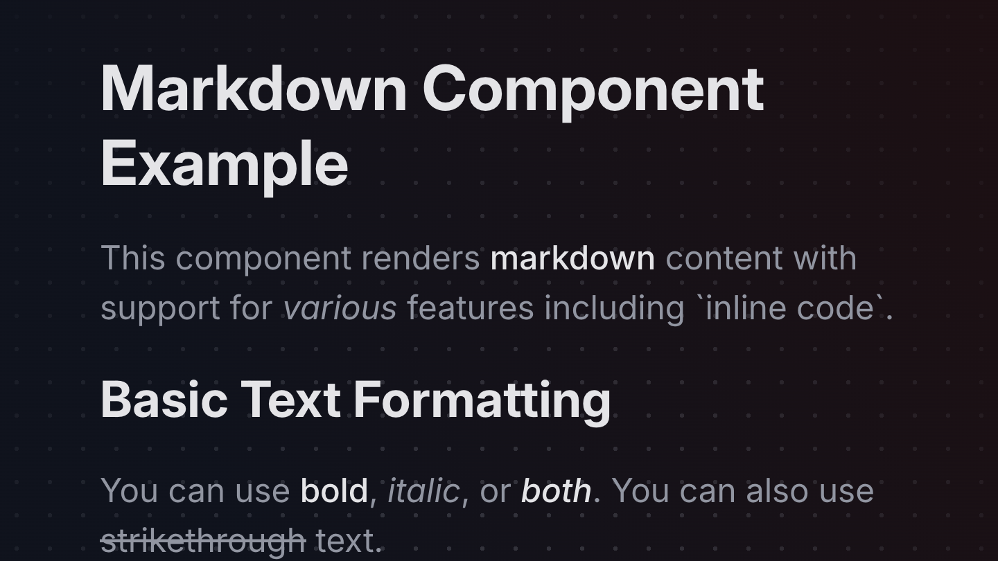
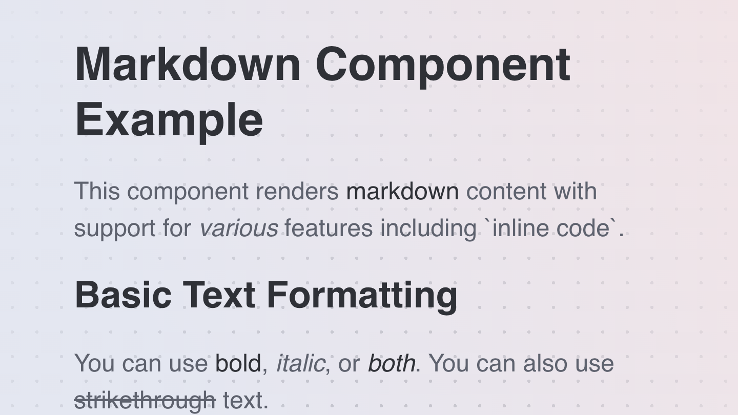
Markdown
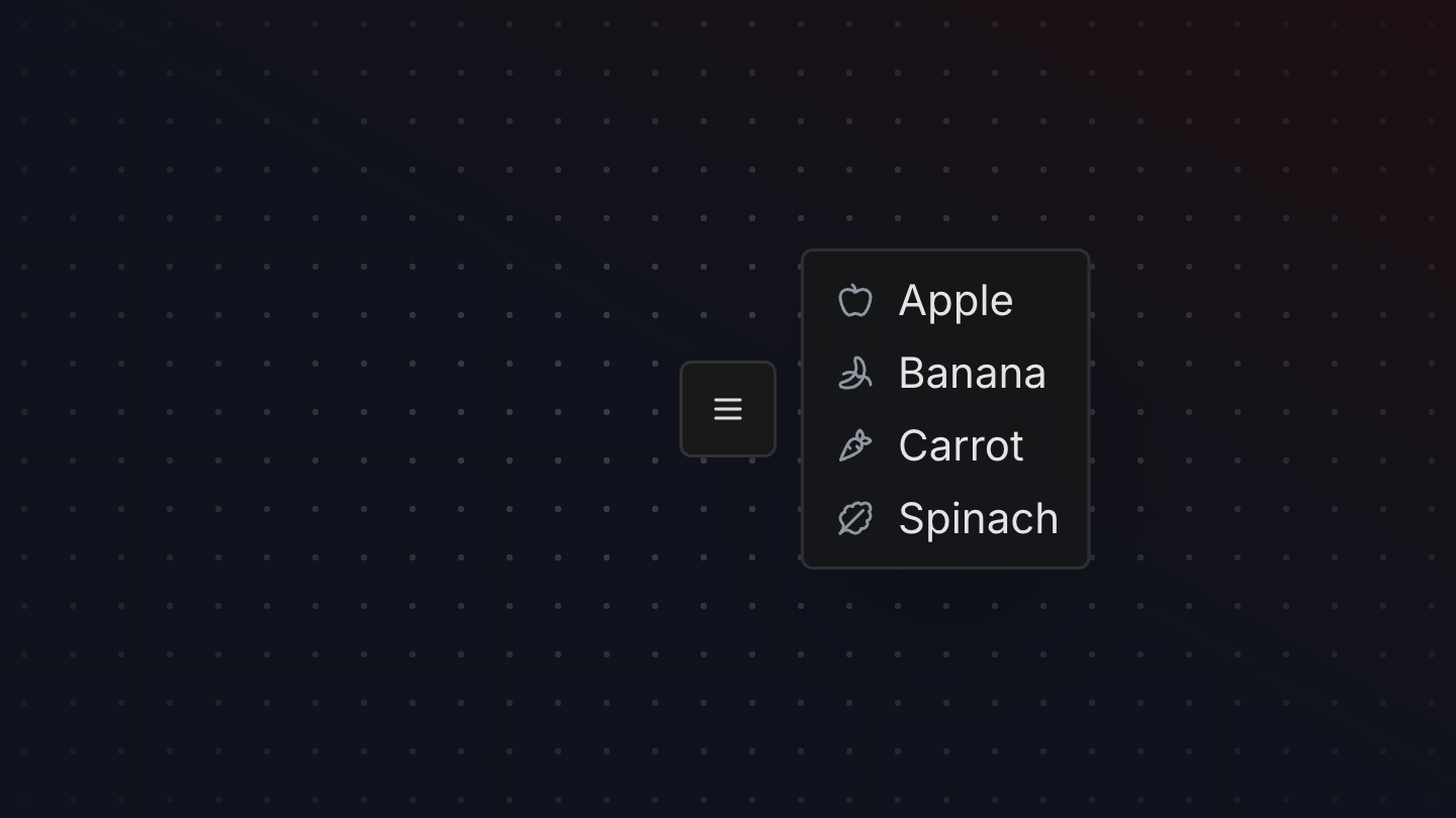
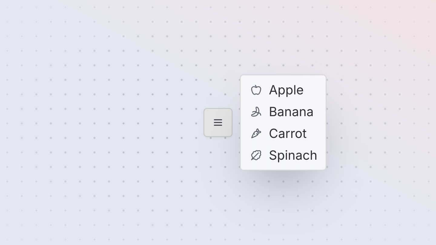
Menu
A menu displays a list of actions or options that a user can choose.
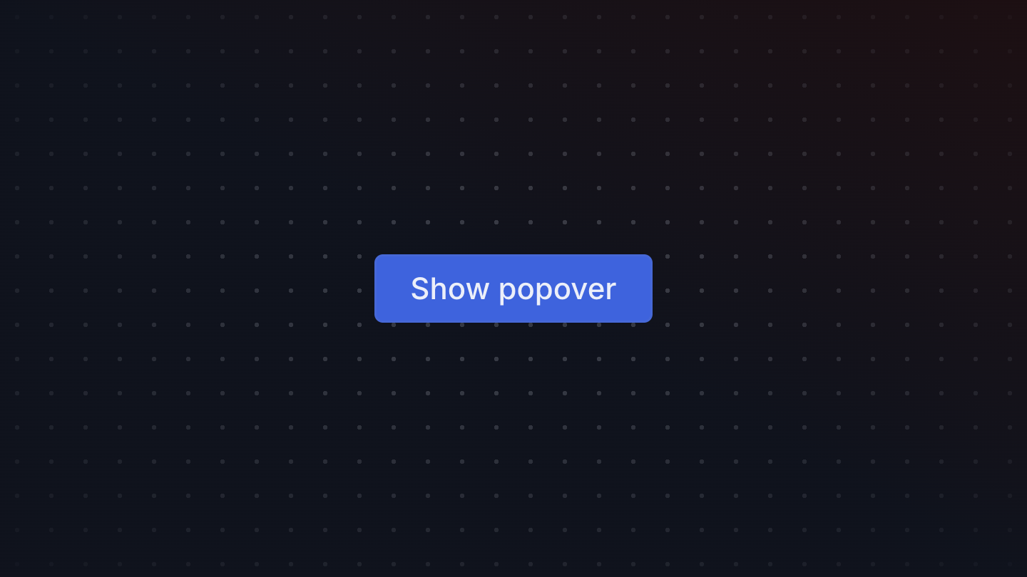

Popover
A popover is an overlay element positioned relative to a trigger.
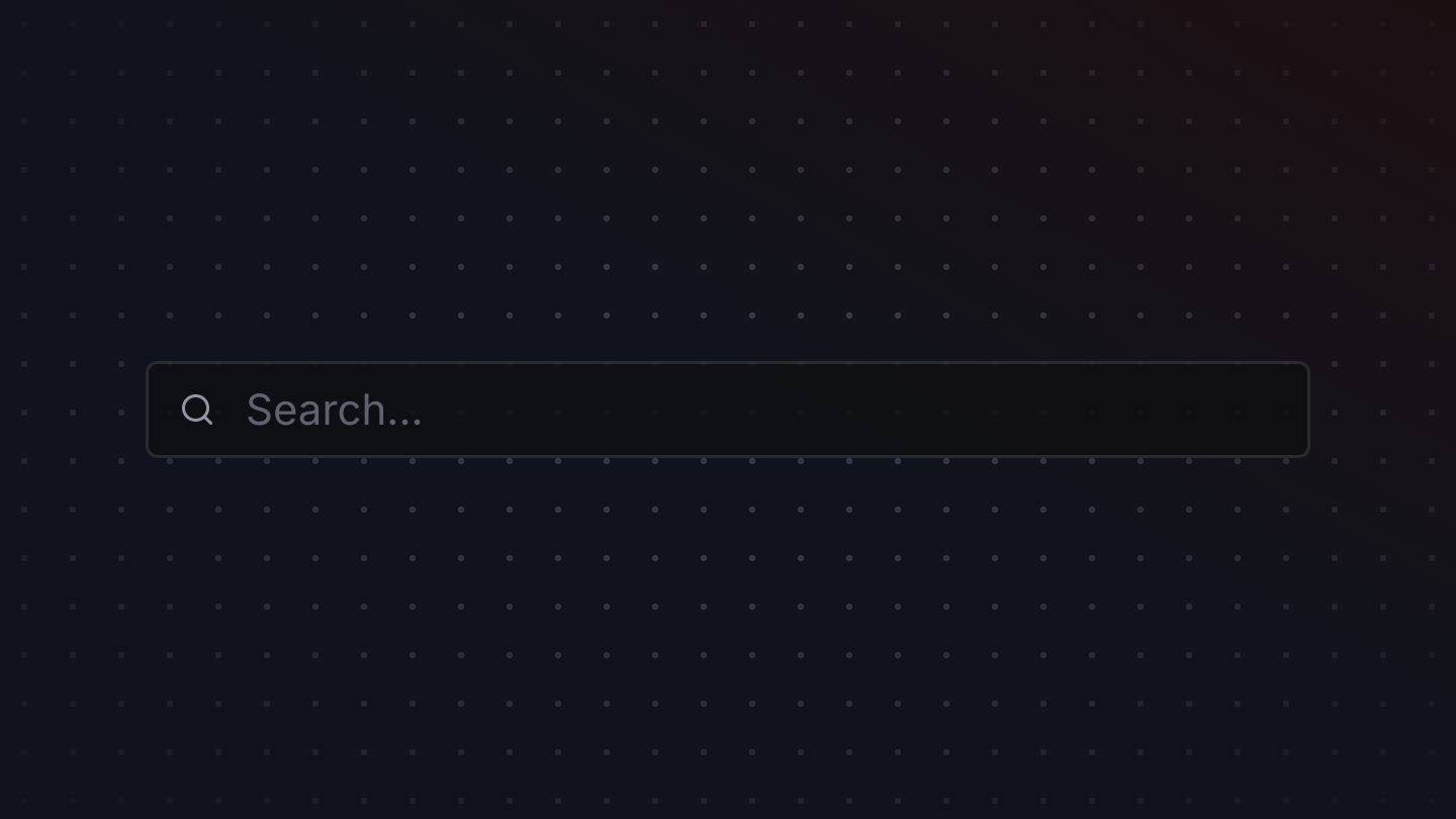
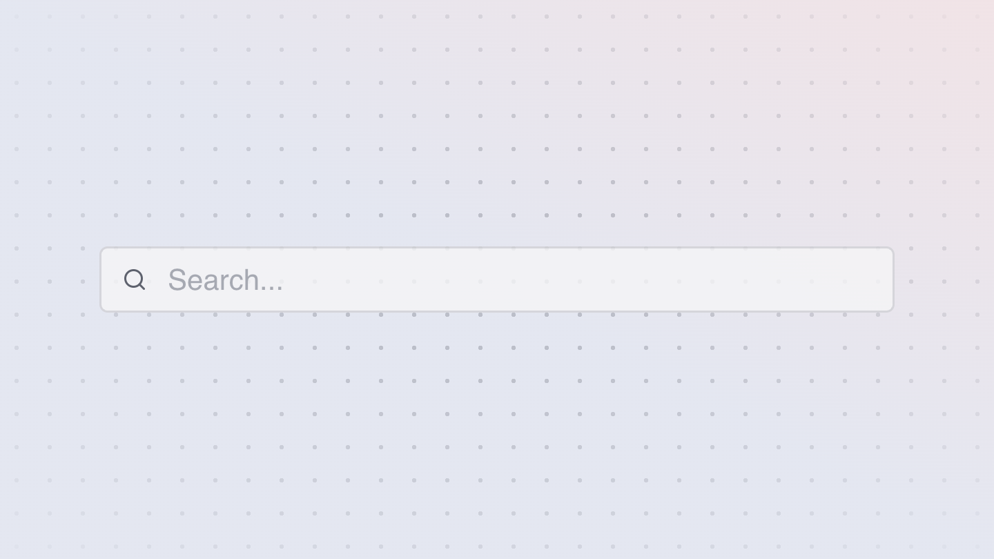
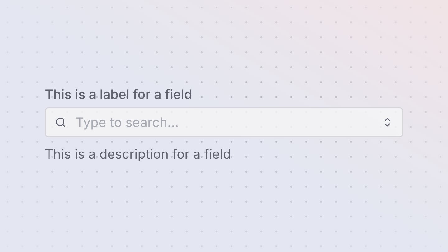
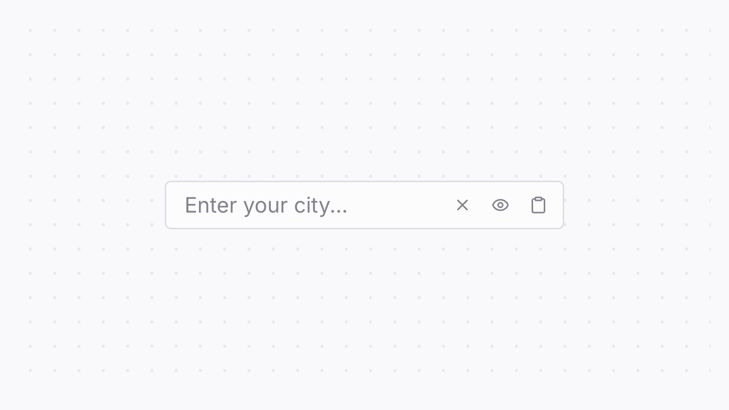
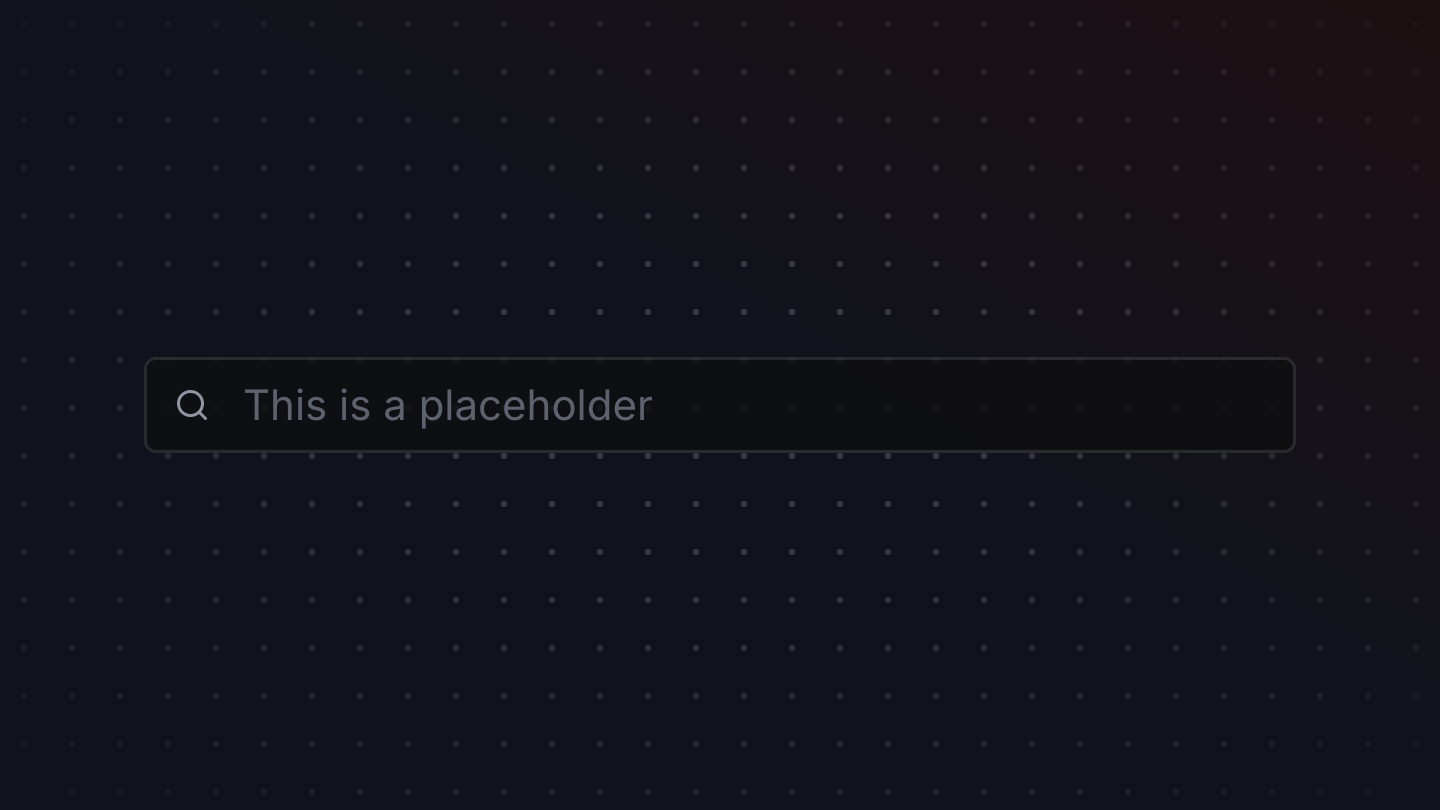
SearchField
A search field allows a user to enter and clear a search query.
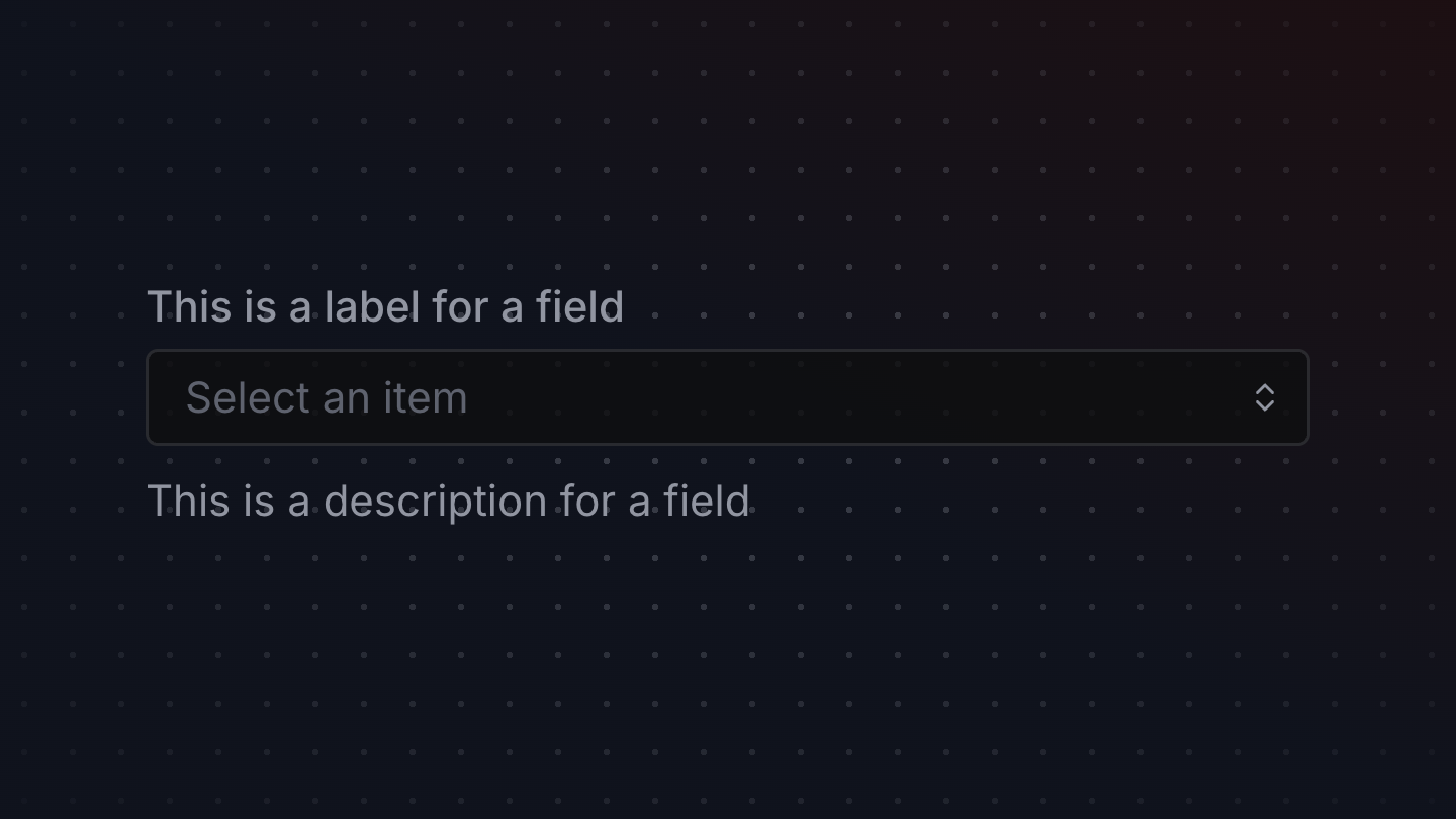

Select
A select displays a collapsible list of options and allows a user to select one of them.


Skeleton
An animated Skeleton component, for use as a loading placeholder.
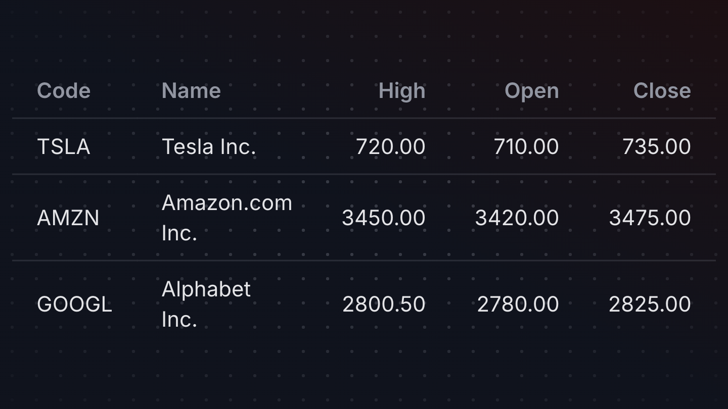
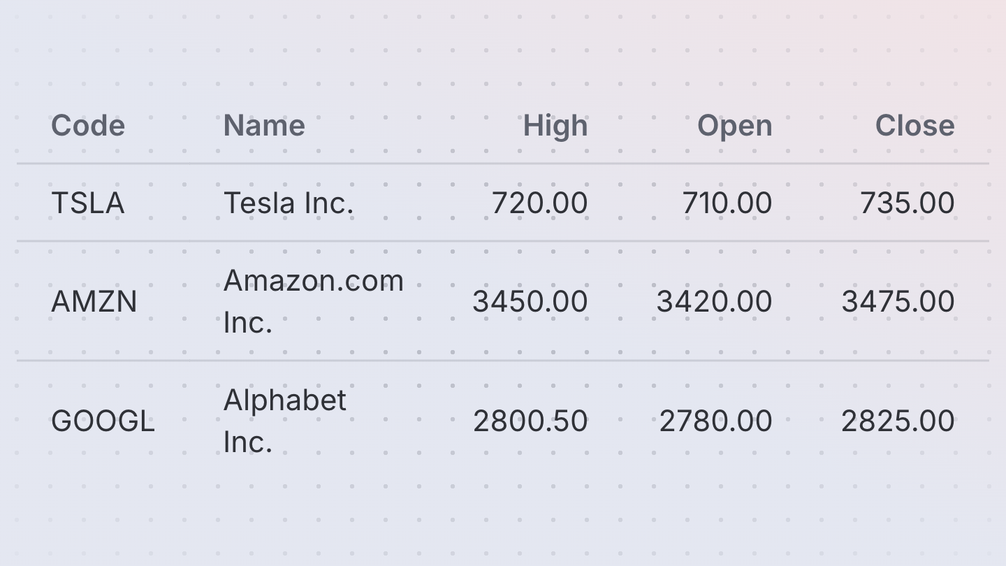
Table
A table displays data in rows and columns and enables a user to navigate its contents via directional navigation keys, and optionally supports row selection and sorting.
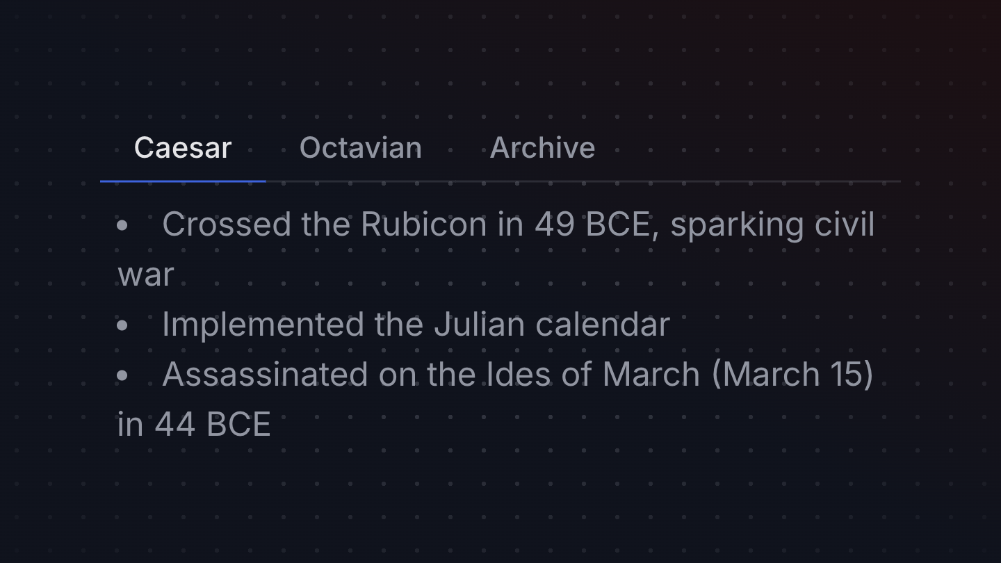
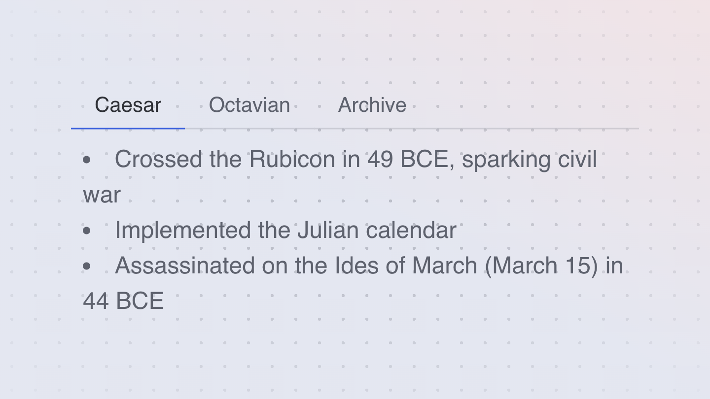
Tabs
Tabs organize content into multiple sections and allow users to navigate between them.

Tag
A Tag is a presentational component used to display short snippets of information, often in a group of tags.
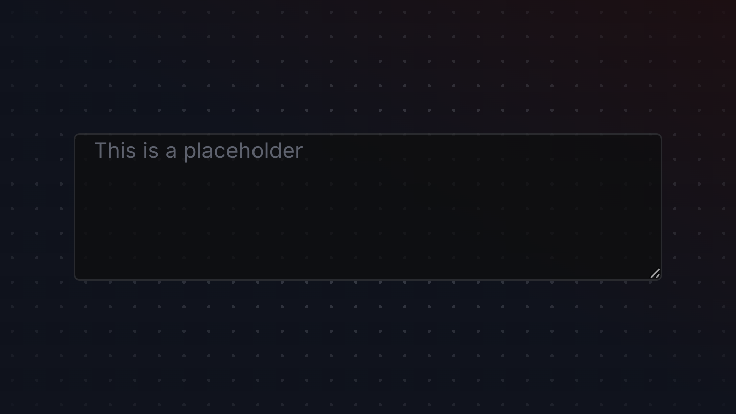
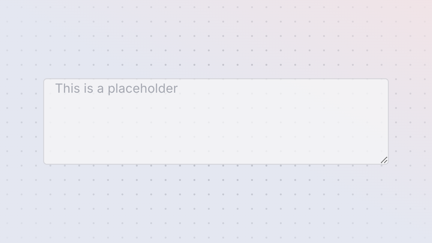
TextArea
An TextArea is a primitive component used when composing fields, (e.g. TextField, SearchField, NumberField).
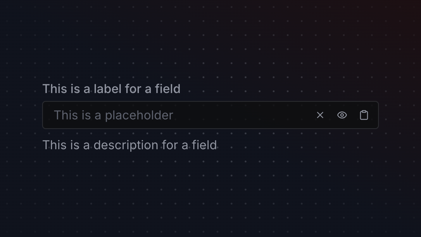
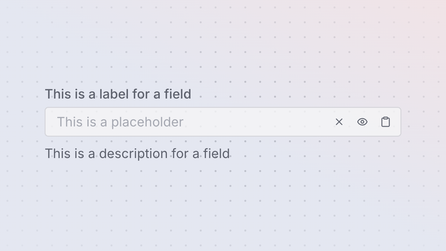
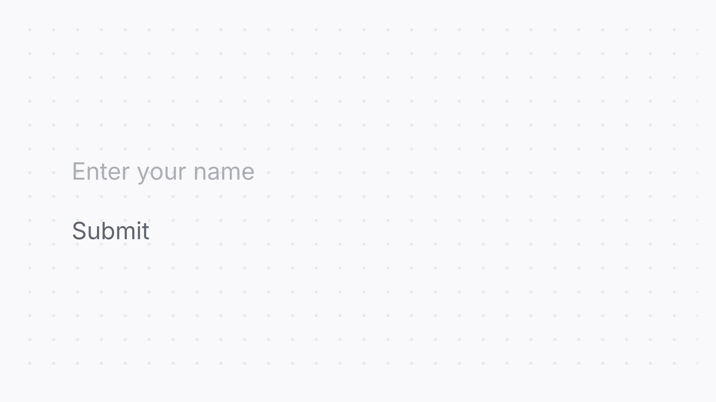
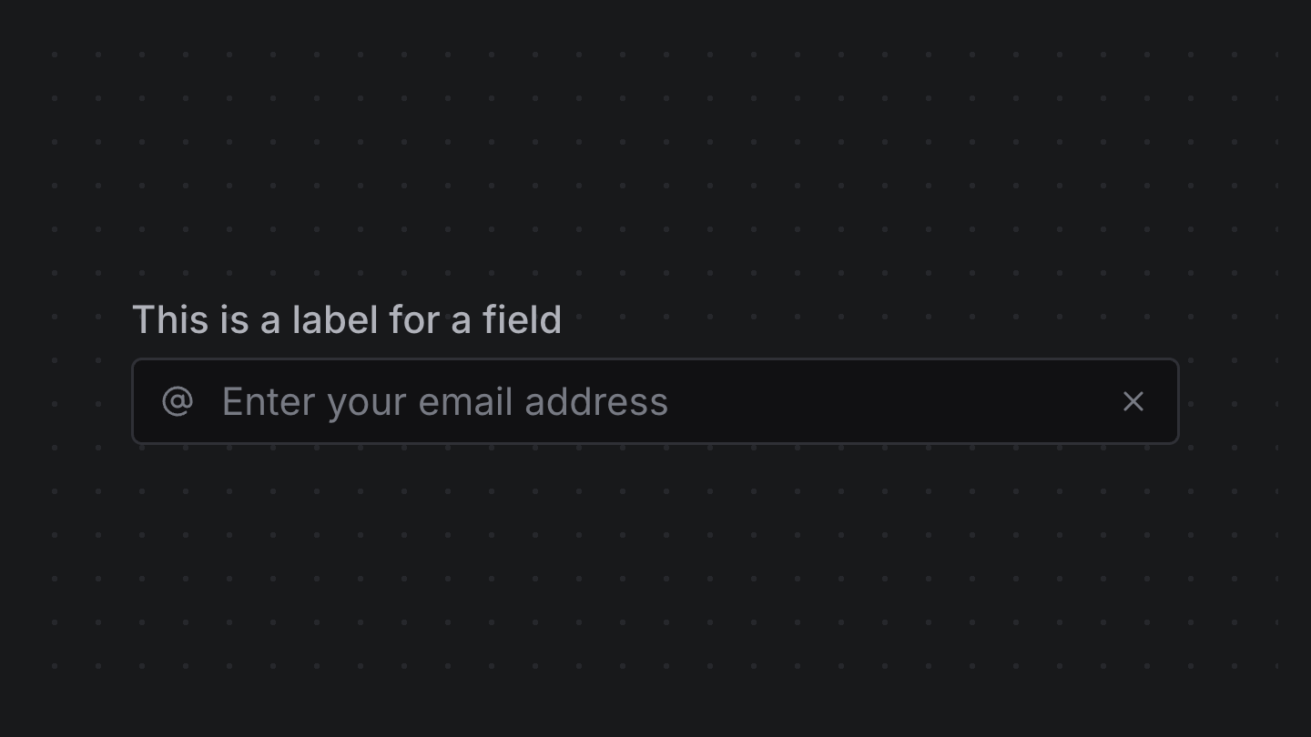
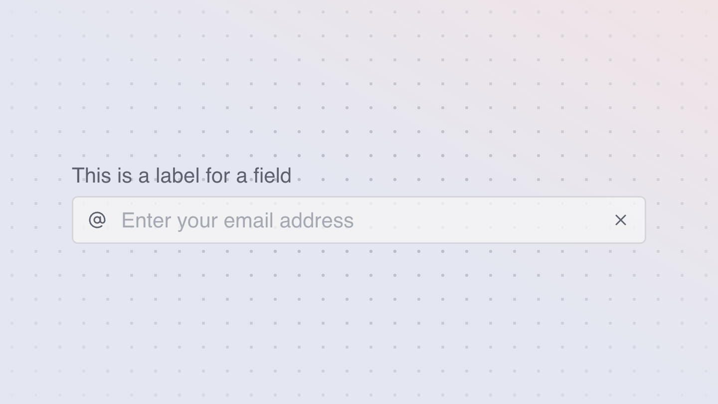
TextField
TextFields are text inputs that allow users to input custom text entries with a keyboard. Various decorations can be displayed around the field to communicate the entry requirements.

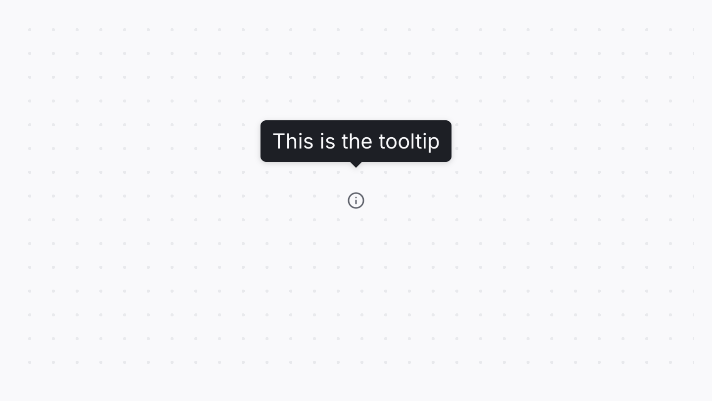
Tooltip
A tooltip displays a description of an element on hover or focus.


TopNav
The top nav component is an ready-made nav that appears at the top of the page.